Fancy Text Showing as Boxes? Why It Happens and How to Fix It
Boxes, question marks and blank spaces where your stylish text should be, the cause is always a missing Unicode block on the viewing device. Here is how to choose styles that render everywhere.
By the Fancy Text Generator Team · · 5 min read · Reviewed 12 November 2026
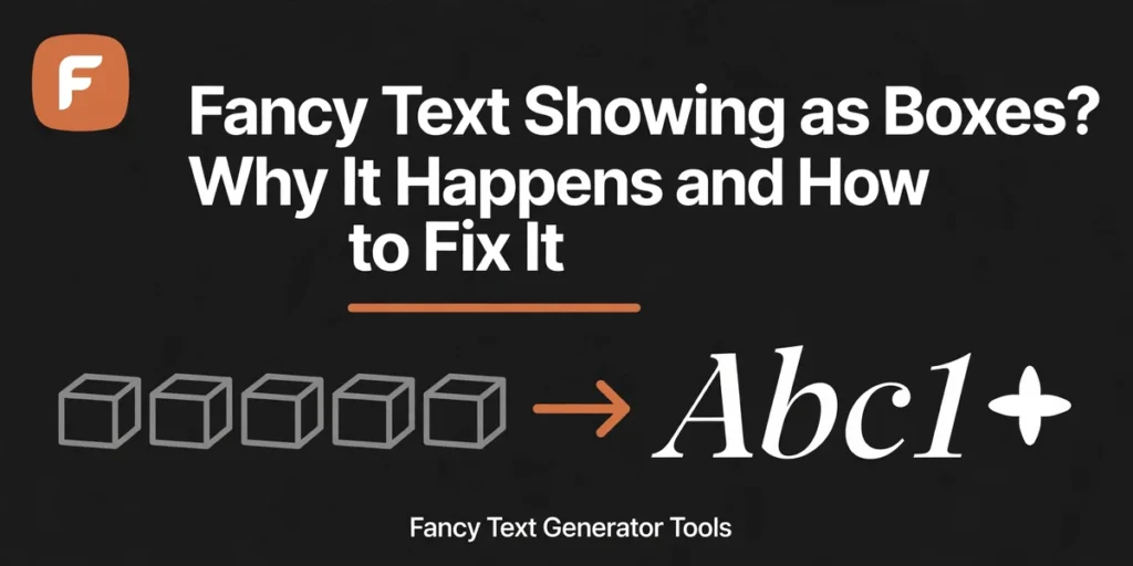
You pasted a beautiful name into your bio. On your phone it reads like calligraphy. On your friend’s phone it reads □□□□□. Nothing is wrong with your text. Those boxes have a name, a cause, and a fix.
The short version: a box means the viewing device has no drawing for that character. The text itself arrived fine. This guide explains why it happens, which styles turn into fancy text boxes most, which ones almost never do, and the checklist for how to fix fancy text boxes for good.
First, the good news: your text is not broken
Fancy text showing as boxes is a rendering problem, not a data problem. The characters you pasted are real, valid Unicode characters that travelled exactly as you typed them. The receiving device simply has no picture for them, so it draws a box instead.
Copy a row of boxes from a phone that cannot draw them and paste it into a phone or computer that can. The letters come back. The box is a placeholder, not damage, and that tells you where the fix lives: in choosing characters the audience’s devices can draw.
The box has a name: tofu, and its technical name is .notdef
Type designers call the box tofu, because it looks like a small block of bean curd. Its technical name is .notdef, short for “not defined”. Every font carries exactly one .notdef glyph, usually glyph number zero. When a font is asked to draw a character it does not contain, and no other font on the device can help, the font draws its .notdef instead: its way of saying “a character is here, and I have no picture for it.”
The shape varies a little. Most fonts draw a plain empty rectangle, some add a question mark or an X, and on a Mac the fallback glyph is often a box with the character’s hex code inside it. Google’s font family built to end this problem is called Noto, short for “no more tofu”.
Not every strange symbol means the same thing
Before you fix anything, look at the shape. An empty box (□) means a valid character with no glyph: your data is fine, and the fix is a font or a safer character. A black diamond with a question mark (�, U+FFFD) means the bytes could not be decoded at all, usually a wrong encoding, and that one can mean real data loss. A lone box left by a dropped image or sticker is often U+FFFC, a placeholder for an embedded object. An empty box is cosmetic. A black diamond is a different job.
How a phone decides what to draw
When a page or app renders text, it walks a list: first the fonts the page asked for, then the operating system’s fallback fonts, one by one, for each character separately. Only when the whole chain comes up empty does the box appear. That walk is called font fallback, and it explains almost everything confusing about fancy text boxes.
Fallback is per character, not per word, so one name can quietly mix three fonts. No phone ships with a font for every character: Unicode holds well over 150,000, while a typical system font covers a few thousand. Apple, Google, Samsung and Microsoft each ship their own font sets, which is why the same bio can look perfect on an iPhone, fine on a Pixel, and boxed on a three-year-old budget Android.
Which styles break most
Not all fancy alphabets are equal. They live in different Unicode blocks, added in different years, and font makers cover them unevenly.
Fraktur and double-struck: the fragile pair
Fraktur (𝔉𝔯𝔞𝔨𝔱𝔲𝔯) and double-struck (𝔻𝕠𝕦𝕓𝕝𝕖) turn into boxes more than any other common style. Both live in the Mathematical Alphanumeric Symbols block (U+1D400–U+1D7FF), and both use glyphs that some font makers left out. Bold and italic live in the same block and almost never box, so the block itself is not the problem. The problem is which glyphs inside it vendors chose to include.
How bad is it in practice? One guide that pasted the full block into apps on iOS 17, Android 14, Windows 11 and macOS 14 in October 2025 found tofu in only two places: a Samsung Galaxy A-series phone on pre-2020 firmware, for fraktur, and the default terminal on Ubuntu 22.04, for fraktur and double-struck. Every modern phone and every mainstream chat app rendered the block cleanly. The risk is real but narrow: old firmware, minimal systems, and a few branded fonts that skip the block.
Script is riskier than it looks
Script (𝒮𝒸𝓇𝒾𝓅𝓉) uses the same block, and eight of its capitals, B, E, F, H, I, L, M and R, do not exist in the math block at all: they are borrowed from the older Letterlike Symbols block. Script is still one of the first styles to box on old devices, so keep it short, a name or one line.
Black bubble and black square letters
Plain circled letters (Ⓐ) live in Enclosed Alphanumerics, a block from the first version of Unicode, and they are safe. Black circled and black squared letters (🅰) live in the Enclosed Alphanumeric Supplement (U+1F100–U+1F1FF), a much newer block from Unicode 5.2, and they sit next to emoji in the standard. On some phones they render oversized, like emoji, instead of boxing.
The safe list
If your audience is the whole internet, these are the styles to build on. Bold, italic and bold italic come from the same math block as fraktur, but they were added in Unicode 3.1 in 2001, and system fonts have shipped them for generations. Bold sans (𝗙𝗲𝗡𝗰) is the same story in a different range.
Small caps are the quiet overachiever: small capitals exist for 24 of the 26 letters, and only Q and X have none anywhere in Unicode. They come from the IPA and phonetic extensions, characters that have lived in fonts since the early Unicode versions, which is why they almost never box. Keep your searchable name plain, since search does not match them: NFKC does not fold them back.
Plain circled letters are about as old as Unicode gets: the Enclosed Alphanumerics block dates to the first version, every circled capital is assigned, and every modern font covers them. They also fold back to plain text, while the black versions do not. Strikethrough and underline are just combining marks layered over plain letters, and the marks (U+0300–U+036F, all 112 assigned) are old and covered everywhere. The rule behind the whole list is simple: older characters break less.
The fix checklist
Work through this list in order. If you are the reader rather than the sender, updating your operating system or installing Google’s free Noto fonts is the fastest fix on your side.
- Test on the oldest device you can find. Your phone proving it works proves nothing.
- Swap fraktur for bold. Same drama, a fraction of the risk.
- Swap black squares and black bubbles for plain circled letters. Same playful look, an older block, no oversized emoji rendering.
- Shorten Zalgo, the glitch text built from stacked marks. If the text looks broken without any boxes, the stack is too tall for the app.
- Keep the important words plain: your name, your contact line, the one sentence that must be read. Style the decoration around it, not the message itself.
- Run the text through the Style Compatibility Checker first. It tests each style family against each platform.
- If it must look identical everywhere, use a picture. A gradient PNG renders as an image, not text, so no font can box it.
What if only one or two letters turn into boxes?
Partial breakage is the most confusing kind of fancy text not showing: most letters render, one or two do not. First, look for a mixed block: a black bubble in the middle of bold text, or one fraktur letter in a script name. The risky character boxes while the rest survives, so find the odd character and swap it.
Second, suspect the generator. Fraktur has five capitals, C, H, I, R and Z, and double-struck has seven, C, H, N, P, Q, R and Z, that do not exist in the math block at all. Good generators fill them from the older Letterlike Symbols block, with substitutes like ℭ, ℌ, ℑ, ℜ and ℨ for fraktur, and ℂ, ℍ, ℕ, ℙ, ℚ, ℝ and ℤ for double-struck. A sloppy generator that points at the empty slots instead will produce boxes for exactly those letters, so if your name boxes only on C, H or Z, try another generator.
The bottom line
Boxes mean a missing drawing, not broken text. The fix is choosing characters the oldest phone in your audience can draw: bold, italic, small caps, plain circled letters, strikethrough and underline have survived every test because they are old and everywhere. Boxes cost you readers, not reach, since no platform treats them as a violation. Test on the oldest device you own, keep the important words plain, and your fancy text will show up as letters, not tofu.
Sources
- RenderScreenshot, “Tofu: Missing Characters in Fonts and Screenshots”
- FormatStudio, “Why Do Some Unicode Fonts Show as Boxes?”
- TypeAnySymbol, “Symbol Showing as a Box? How to Fix Tofu”
- SymbolStyler, “Why My Fancy Font Shows as Boxes (Tofu): Complete Fix Guide”
- FontVibe, “Old English Font Generator”
- FlareFont, “Gothic Font Generator”
- WordsFN, “Fancy Text Generator: Convert Any Text Into Unicode Styles”
- Unicode Character Database (code point ranges, small-capital coverage, combining-mark count and NFKC behaviour verified with Python unicodedata)
Put it into practice
Open the tools this guide points to and try the styles yourself.
Bold Text Generator
Generate 𝐛𝐨𝐥𝐝 Unicode text in serif, sans-serif and bold-italic alphabets, copy and paste bold letters into bios, captions and names.
Open tool → Platform FontsInstagram Fonts
Fancy fonts for Instagram bios, names and captions, script, bold, small caps and aesthetic styles that fit the 150-character bio limit.
Open tool → Colour TextDiscord Coloured Text Generator
Create coloured Discord text with ANSI codes, pick a colour, add bold or underline, copy the code block and paste it into Discord.
Open tool →Keep reading
More guides from the blog.
 Platform Guides
How to Make Fancy Text for Your Instagram Bio (Step by Step)
Your Instagram bio has no font button, every stylish bio you have seen is Unicode text pasted in. Here is the safe way to do it without breaking search or readability.
· 6 min read → Text Styles and Symbols
What Is Unicode Fancy Text? The Blocks Behind Every Stylish Font
Bold that is not bold, script that is not a font. A plain-English tour of the Unicode blocks, Mathematical Alphanumerics, Enclosed Alphanumerics and combining marks, that power every fancy text generator.
· 7 min read → Platform Guides
Discord Fonts and Coloured Text: The Complete Guide
Discord gives you markdown, Unicode nicknames and, hidden in code blocks, real coloured text via ANSI codes. How all three systems work, and when to use each.
· 6 min read →